

Piano
This Post Contains No Music

Music is an art form that cannot be quantified or explained with words or numbers. Today’s post attempts to quantify music with words and numbers. To be specific, we are quantifying a few periods of piano playing. In order to understand the data, we have to understand MIDI.
This post has many interactive charts and graphs that look best on a bigger screen or at least in landscape mode on your phone. If you’re reading this in your email, try viewing in your browser to get the most use out of it.
What is MIDI?
In its simplest explanation, MIDI (pronounced “middy”) is a decades old, technological standard that allows an electronic musical instrument—in this case a keyboard—to send digital information that represents music. Each of the piano keyboard’s 88 notes is assigned a number. The velocity in which you play a key is assigned a number. A note or pedal that is depressed or released is assigned a number. Everything is digitized.
On a piano, there are theoretically infinite volumes at which you can play a note depending on how much force you use to strike the key. In MIDI, this value is limited to only 128 possibilities: the values 0 - 127. The keyboard I used for this exploration also has a “sustain pedal” like a piano. Again, on an acoustic piano there are almost limitless ways to use the pedal (as it moves a piano’s dampers away from the strings allowing them to ring freely without having to hold down keys). On this MIDI keyboard, the sustain pedal is either engaged (value 127) or not (value 0).
You may begin to see why quantifying the piano might be difficult.
The Dataset
Most of this data set is original and entirely unique because I practiced some music for a short period of time, recorded every single MIDI event (in the tens-of-thousands), and cleaned, converted, and analyzed the data set. Below is a sample of the first 10 rows (events) after 20 minutes of practicing some Chopin (Etude op.25, no. 11) and Liszt (Hungarian Rhapsody no. 11):
Every Event has its own row. In this data set, there are only 3 event types: note_on (a key is pressed), note_off (a key is released), and control_change (in this data it is used exclusively for the sustain pedal). Value is the velocity of a key press (remember it is an integer from 0 - 127) or, in the case of the sustain pedal, a binary on/off as explained above.
Each note has a text representation (eg. C3 is “Middle C” by the MIDI standard) and a numerical representation (60). The Timestamp of each event is measured down to the thousandth of a second, or millisecond, and then, as each row is sequential, the Seconds_Difference column measures the time before the next event.
Let’s explore.
Playing Piano Is Busy
In any given second, multiple piano keys can be struck and released by any and all of our ten fingers. In fact, during the busiest single second of playing, 55 events were recorded.
Close to 30 of those events were notes being played with the pedal and notes being released accounting for the other 20 or so. All of those 55 events happened at 10:03:26 AM.
Every note that is played has to be released at some point and every pedal down has to have a pedal up. To get a cleaner idea of keys being played, everything other than “note_down” can be filtered out:
Keeping the Index the same from the original data set, you can see the “missing” rows which were not keys being pressed. With this simplified set, the length of the data goes from 19,416 rows down to a manageable 9,100 representing that many times a key was played.
While playing starting at 9:46a, I didn’t take a coffee break so there is a fairly steady increase of the notes played:
When it comes to how hard the keys were pressed, we have the MIDI velocity to help quantify this. Each of the 9,100 notes played has an associated velocity (technically it’s a measurement of the key’s speed hitting the sensor under the key bed, but you can think of it as how hard a key is played). The frequency distribution plot below is a graphic representation of the frequency of Velocity values. The x-axis is the measured velocity and the y-axis is the count or frequency of that value. The KDE (Kernel Density Estimation) line represents a smoothed estimate of the probability density function of the underlying distribution of the data. The plot shows a “bell-shaped” curve, hinting that the data might follow a normal distribution.
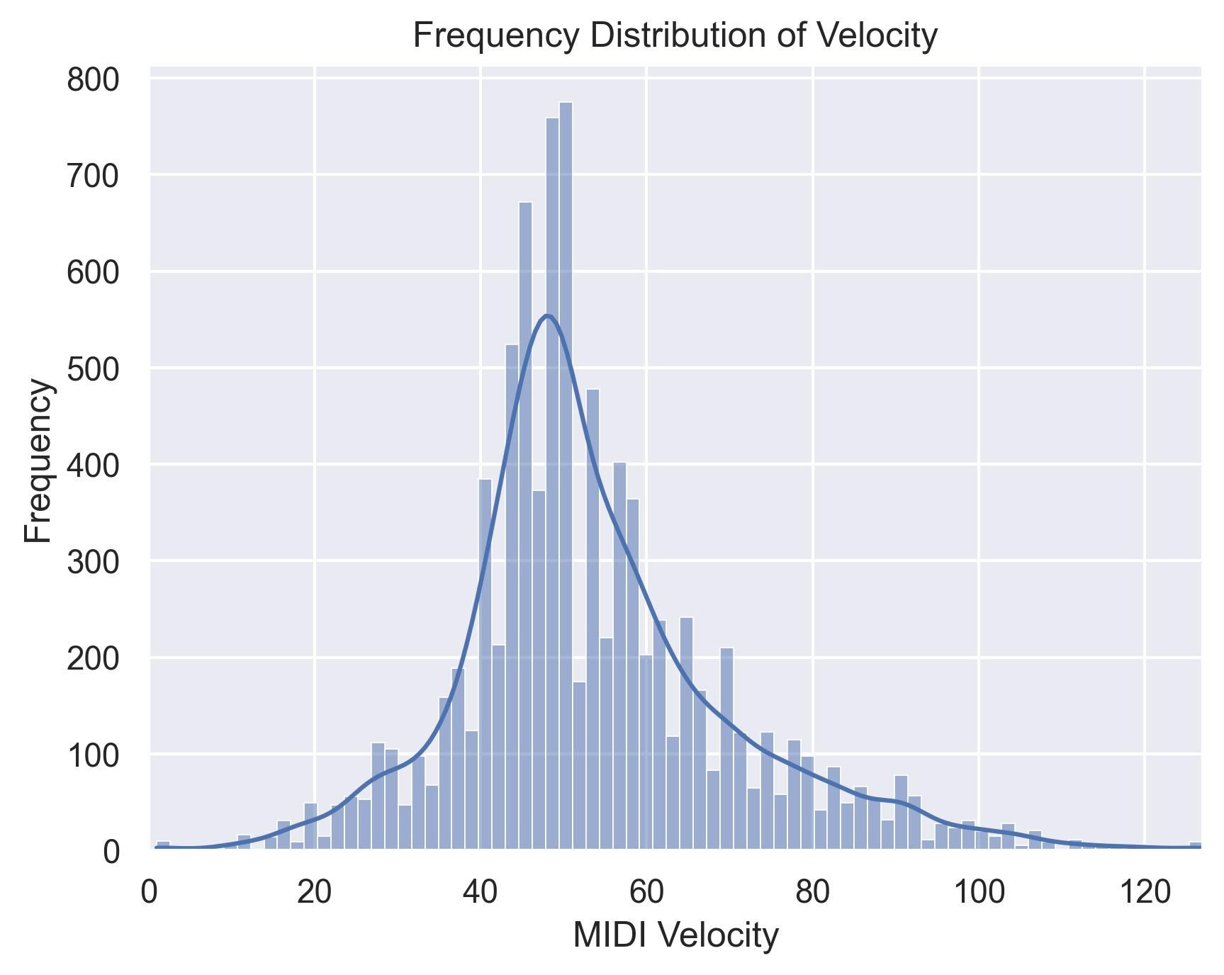
I managed to play 119 individual MIDI velocities (1 - 127) including velocity 1 (probably accidentally grazing a note trying to play the last page of the Liszt) and 127 (the actual last chord I played).
Of course the particular keyboard’s “velocity curve,” sensitivity, and some other technical elements would come into play. Again, music is hard to measure.
88 Keys
With 88 keys on the piano and close to 20 minutes of playing what I would consider some serious repertoire, you might think that all 88 keys would be played at some point. Close, but no cigar:
This spreadsheet is sorted in order of the keys on the piano from left to right, low to high. (Middle C is normally C4, but in the MIDI world, everything is shifted and Middle C is C3.) Right off the bat you can see that three lowest keys were not played. This explains why there is a fine layer of dust collecting on them. The same goes for the opposite extreme of the piano for the three highest notes. You can click the table header to sort to see that the more “middle” of the piano you go, the more frequently played the note happens to be.
The static chart below shows the keys sorted like the piano and how frequently they were played.
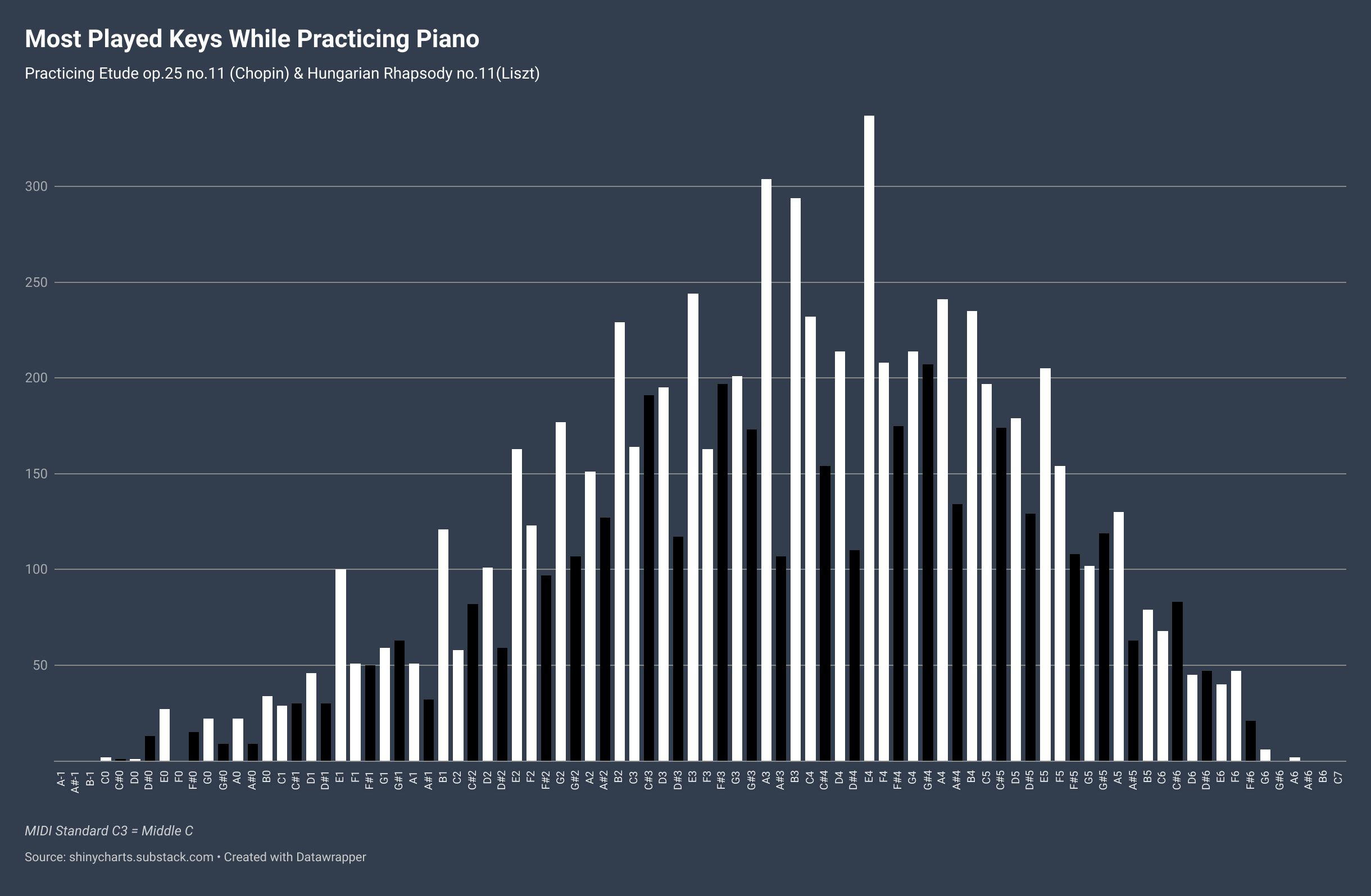
Meanwhile, while looking at the “topography” of the piano, the black keys seem to have been neglected just a little bit. There are 36 black notes on the piano (52 white), but the percentage of notes played shows that the distribution wasn’t quite even.
That being said, for a comparison, here was a previous practice session where I read and practiced some Mozart (K.265 “Twinkle Twinkle…”). It was mostly in the key of C. If you don’t know what that means, you’ll probably understand when you compare the Chopin/Liszt above to this previous session:
(That was easier.)
Music Isn’t Data
Okay, maybe it can be. It’s probably more fun to listen to and play the piano, but it’s fun to attempt to quantify it nonetheless.
If you’re curious as to what the Liszt and Chopin pieces sound like, here’s world-renowned concert pianist Lang Lang playing the Chopin and a 10 year who plays the Liszt better than me.
This last visualization is the representation of all the notes played over the duration of the practice session from which the dataset comes. The last page of the Liszt is in the key of F# (lots of black keys closing the gap at the end).